http://www.channel4.com/programmes/my-mad-fat-diary/4od
My Mad Fat Diary
In this programme, the protagonist named Rae Earl, is an overweight teenage girl who has recently left a psychiatric ward. The episode above begins with her narration on her losing her virginity, as well as the morning after it happened.
From these first three minutes, the programme seems to present her very realistically in the role of a teenage girl - arguably too realistically, as teenagers in TV are usually beautified to some extent with the use of make up or flattering clothes to make them look more attractive, but in the case of Rae there is no obvious appearance of make up, her hair the morning after appears to be more messy than it would normally be portrayed on television, and her clothes are very simple, modest and dark - not bright and cheerful which teenagers are usually presented to wear. On one hand, this is a fairly positive representation, as it normalises the appearance of a teenage girl without touch-ups to the audience which allows teenagers alike to personally identify with Rae and also allows the show to focus more on her experiences and feelings rather than looks, which helps in humanising her character as more than just a 'fat chick'. However, it can be argued that her plain appearance in the show doesn't help in representing overweight people on television in a positive way, as her features are not celebrated in the way they potentially could be. This kind of representation supports the negative stereotype that fat people cannot be attractive. It is impossible to deny that Rae's weight isn't a vital part of the plot, as even the show's title is a reference to her weight. However, the show tries to side the audience onto Rae's side of any conflicts and uses her experiences to provide information to what it is like to be an overweight teenager.
Friday 28 March 2014
Wednesday 5 February 2014
The Cultivation Theory
The Cultivation Theory states that the more a person is exposed to the media portrayed in television, the greater its effect is on the person's judgement on the world, based on what they are exposed to. It affects the viewers in a passive rather than an active way, influencing the peoples' attitude to the world rather than their behaviour towards it. Gerbner and Gross - who coined the theory - suggest that television has the same power over society in the modern day as religion has had in earlier times.
One of the most common examples of the cultivation theory in practice is the urban belief that violence in youth that is shown on the news stems from violence shown on TV and video games. However, because the cultivation theory suggests that the effects of TV are more passive than active, it argues against this belief. Implying the cultivation theory into this belief would suggest that those affected by the exposure to media are not the violent individuals but those who support and believe it. This is because the portrayal of violence on TV involves a focus on youths and represents youths more commonly in a negative way rather than a positive one, and violence on TV itself has become more accepted by society over the years, as viewers become more immune to its primary purpose of shocking the audience. With the strong link between youth and violence in the media, people grow up accepting these stereotypes as fact, because that is what they are exposed to from the earliest stages of their life. This alters the views of of people towards youth in the real world, as it can cause people to judge and fear teenagers and youths in public in case they have an outburst of violence, as that is how the media has portrayed them.
The site citation.allacademic.com points out that 65% of video games feature violence as bloodless and and frequent, and in a way which disregards its long-term effects on others; thus normalising it amongst video game players. And though articles like this one argue against the popular belief on certain crimes committed by young people to be influenced by video games, statistics such as the former have been accepted by the public to be a factual correlation with crime, when it could mostly be coincidence. There are books written as early as 1999 (Stop Teaching Our Kids To Kill by Lt. Col. David Grossman) which stirred controversy on the subject, and Grossman has defended his opinion by describing first-person shooter games as "murder simulators"- proving that this urban belief has already been around even in the early days of the timeline of video games. The article on the Sandy Hook shooting is as recent as 2013 and the proof in the long-term effects of the cultivation theory is evident in how the police had to make an official statement to the public to decline the statement that has been reinforced by a national outcry whose beliefs stem from the reinforced negative representation of young people.
Monday 3 February 2014
Representation of age in the media
Older peoplehttp://www.dailymail.co.uk/femail/article-2550656/FOREVER-BEAUTIFUL-Make-turn-clock.html
In this article, the representation of age is shown as negative. It is an article on beauty, aimed mainly at women, as it was featured on the 'femail' section of The Daily Mail. It's about the 'secrets', tips and tricks on looking more youthful with the use of makeup, and the title 'forever beautiful' suggests that old age is not a connotation of beauty, but youth - which isn't eternal - is. Wrinkles are an obvious sign of ageing and they are described as 'age-related issues' which need to be fixed, and the fact that a completely natural process is described as an 'issue' reinforces a very negative and self-loathing connotation of age amongst women.
Younger peoplehttp://www.dailymail.co.uk/tvshowbiz/article-2547425/Justin-Bieber-set-arraigned-Miami-DUI-Vanlentines-Day.html
This article is about the young celebrity Justin Bieber and the follow up of his arrest for driving under the influence. The article describes Bieber in a negative and immature way as the writer antagonises him by listing his charges, then follows it with "Meanwhile, the 19-year-old has been looking like he doesn't have a care in the world as he frolicks on a beach in Panama with his entourage." This makes Bieber sound irresponsible and spoilt as it creates the impression that he has gotten away with his crimes for being rich and famous since he isn't currently in jail. However, the focus on his upcoming arraignment makes it sound like an event worth looking forward to as it may result in potential punishment for Bieber, and thus creates a negative ideology where the reader is encouraged to look forward to the punishment of a young person. The ideology conveyed in this article reinforces the stereotype that young people are troublemakers and irresponsible.
Friday 31 January 2014
Representation of Gender in the Media
Female Representation1) A sexualised, objectified female in advertising - Grand Theft Auto 5 promotional art
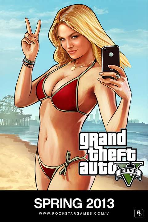
This advertisement consists of a long shot of a white, blonde, young woman in a bikini, posing with her phone. This poster has been the poster most commonly used to advertise GTA 5, most likely since its controversial nature would bring attention to the franchise before the game's release. Her bikini exposes most of her skin, and the red colour brings attention to the only parts of her body that remain covered. She fits the stereotype of an attractive woman, as she's visibly thin, has flawless skin, large breasts, small facial features, a gentle tan and long blonde hair. The focus of the viewer's gaze is aimed for her chest, as the position of her in the photo places her chest to be in the centre of the image. The only way in which the poster links back to the objective and plot of the game is the background, which matches the setting of the fictional city based on Hollywood. However the woman who is the main focus of the poster doesn't seem to show any particular relevance to the storyline.
2) Domestic woman in a film or TV show - Lois Griffin from Family Guy

The demographic audience for Family Guy consists mainly of Americans of the C and lower socio economic demographics, with a narrower focus on teenagers and youth of both genders. Family Guy is a sitcom, and therefore has an episodic plot, almost always focusing on the Griffin family, of which Lois Griffin is a member of. She is the wife of Peter Griffin and the mother of their three children. Her portrayal throughout the series is mostly shown to be a carer for Stewie, the youngest child, as a full-time mom. She is a white, ginger woman, with a curvy figure and she's usually seen wearing red lipstick, earrings, a teal shirt, beige trousers and flat shoes - which suggests a casual appearance leaning onto a formal side. Aside from her large nose, her features are typical of a stereotypical suburban mother, as she isn't portrayed in a neither an attractive or unattractive way, though her lipstick and earrings might suggest that at least she tries to look nice.
As her job as a mother is mostly centred around taking care of the baby, she isn't seen out of the house as often as the other family members throughout the show. Her appearances and gags are often focused around housework and nurturing the needs of Stewie and her lazy husband Peter. Her role in the show seems to also focus on being the one to whom the other characters turn to for advice, which further stresses her portrayal as a stereotypical woman and mother - maternal, mature and understanding.
3) Post Feminism - Lilly Allen's "Hard Out Here" (2013)
Post feminism: Music Video: Lily Allen – Hard Out Here
The video begins with a scene where the singer is undergoing
a liposuction. As a man in a suit, looking over her operation spews negative
comments about what brought her to the hospital bed, she answers back with ‘I
had two babies’, but is ignored. A television screen showing dancers wearing
revealing clothes is also shown as part of the mise-en-scene.
The scene shifts to her dancing with the same dancers as
shown before, as she sings the chorus ‘It’s hard out here / For a bitch it’s
hard’, which is meant to represent how hard it is to be a woman in today’s
patriarchal society. Some other lines in the song include ‘Forget your balls
and grow a pair of tits’, which is a collocation clash to emphasise her
intention to surpass males in the song and video. By ‘forget your balls’, she
is disregarding the importance of men to encourage the message that females are
just as important and tough as men, but it may also encourage men to see
society from a woman’s point of view.
One of the most influential scenes of the music video is
near the end, as Lily Allen is shown in the foreground of a bunch of balloons
which spell out ‘LILY ALLEN HAS A BAGGY PUSSY’ which is a clear reference to a
similar scene of Robin Thicke’s ‘Blurred Lines’ and the controversy that it has
caused earlier within the year for its sexist lyrics and motifs – the inclusion
of this scene in Allen’s video is a backlash at the encouragement of date rape
and further stresses the feministic theme of the song.
Lily Allen’s demographic would be assumed to be fans of her
music from the late 2000’s when she debuted. After taking a hiatus from music
at about 2009, she came back in 2013 with this song, which possibly caused a
shift in her demographic to a more female-focused one, as her new feminist-centred image has likely pushed away some of her male fans who struggle to agree with her views.
Monday 27 January 2014
Mock Exam Improvement
In my mock exam which I have sat in January, I received 27 marks for Q1, a total of 17 marks for Q2, and 17 marks for Q3, with my final grade in the mock adding up to a low C.
Audience Question
- Be specific when mentioning age groups within the target audience of a media text: instead of generalising an age demographic (e.g. young girls, teenage boys, older men and women), mention a specific age group, e.g. young girls between the ages of 15 and 25
- Develop my answer further and add more detail
Representation Question
- 'Your own detailed examples' in the question refers to detailed research and must refer to specific media texts: different media texts such as an advert vs a magazine front cover may present the same person in different ways, so the mention of a particular representation of a person must include an example of the media text which presented them in this way
- When mentioning connotations, justify why they have been used
- Denotation = the item; Connotation = the meaning behind the used item
- Mention the use of language in the media text more often
Revision and StudyTo improve my revision, I think I should focus more on memorising the media terms and revise the theories more, so I have a deeper knowledge of them and can use them in my answers more fluently. I should also learn to apply the relevant theories into different media texts. Another way to improve my revision is to link the use of media and technical terms back to their connotations more often.
CourseworkFor my coursework I believe that the aspect I could improve the most on is the report, as I should focus on the most relevant features within my textual analysis and my magazine product in my writing. I could have also put more focus on the questionnaire, as I haven't used its results as prominently within my research at the start of the coursework as I should have done.
Monday 9 December 2013
PRODUCTION: double spread final draft
For my final front cover, I have chosen the winter issue out of the two front covers I made, and the double page spread is loosely based on the winter front cover - what mainly links the two are the main images i used for the front cover and double page spread of my magazine, where the model is wearing the same clothes in both. The main cover line on the winter issue also links back to the double page spread's article, as both are about the same person.


(The faint guideline in the centre indicates where the page would be folded if it was printed)
This double page spread from INDIE magazine is what I heavily based my double page spread on:

However, I was only able to copy the aesthetic conventions of the above double page spread: my article text was improvised as I found the text in INDIE's article too small to read for me to have a basis on what to write. In my article, I considered that the target market of PIXIE, like in the case of INDIE, are young individuals of both genders from a higher economical income. Many of these young people interested in fashion who would read magazines like INDIE would run their own blogs on sites such as Tumblr, Blogger or Pinterest. This is why I have used a fair amount of lexis which is often used on such sites, as it makes the magazine seem up-to-date in terms of the latest trends, as well as interactive with these social media communities.
Friday 15 November 2013
PRE PRODUCTION: Front cover final draft
As you may know, my magazine is called 'Pixie', and here they are: the summer issue and winter issue.


EDIT 09 / DEC / 2013: I edited the errors in the summer issue of the front cover, including the small 'S' near the main cover line that wasn't meant to be there. I also changed the main cover line font and text, as I felt that the exclamation mark doesn't go with the genre of magazine which my front cover is based upon. The new font is much bolder and easier to read, and the use of italics make it look more 'indie' and unique. I changed it to 'OLD SCHOOL' as it reflects the vintage-inspired, indie fashion often featured in magazines like these, and because it's a recognisable collocation. Additionally, I felt the colours of the first draft weren't warm enough, so I slightly altered the main image with the use of curves as well as lowering the contrast - which gave the photo warmer undertones to reflect the season of the issue.

Subscribe to:
Posts (Atom)