Wednesday 23 October 2013

First draft front cover


For the genre of my front cover, I picked a higher-brow women's fashion magazine, with inspiration taken from the likes of Nylon, Indie, and Topshop magazine. The masthead I chose is 'Pixie' - it relates to the alternative 'pixie cut' hairstyles associated with more fashionable young women, and it is also a reference to the font it is written in, a pixel font. I think it's effective for this magazine as I feel that pixels and pixel fonts have connotations of video games, youth, punk/grundge, individuality, simplicity and retro. The chunky, 'bubbly' shape of the letters were inspired by the Nylon masthead, and also give the magazine a nostalgic and cute image, which goes well with the intended audience of the magazine being young girls and women from the ages of 16-25 who would possibly dress with cute and bubbly trends in mind.

I based the white frame of the magazine (which isn't very visible on here) on the layout present in every Topshop magazine which has been released since I was aware of its circulation. I feel that the frame works well with the white masthead and contrasts against the darker brick wall background, to give the front cover a sense of balance in colour. It's also sharp and clean-cut, which again contrasts against the brick wall's rough and heavy texture. All of this effectively make the front cover look individual, which is a vital feature of Indie's image in the press.

I was aiming to feature a minimal amount of cover lines, just like Indie usually does. However, I felt that the image I used was not enough to make a statement, so I added two additional cover lines to fill the space on the right. I also shifted the model slightly to the left, so her body fits better into the rule of thirds. I also did this to take a different approach from most magazine front covers which would place the model in the centre, to further strive for an individual overall image of the cover.

The main cover line is focused on the model, and is also written in a pixel font, to balance out with the masthead across the top of the cover. I featured only the model's first name, so it evokes a sense of familiarity amongst the model's fans. Because the main cover line text wasn't easy to read on it's own, I added a brush stroke underneath to make it easier to read, which resembles graffiti and adds onto the individual, youthful image even further.




Wednesday 9 October 2013

Magazine Front Cover Analysis

For my coursework, I decided to focus on making a magazine front cover. I decided to focus on the women's style/fashion magazine.


This magazine is named after it's independent, quirky theme. There is only one cover line used here, and it's ambiguous, but assumably relates to the girl in the main image. The minimal amount of puffs used shows that this magazine aims for an image amongst the high brow magazines on the market. This is because many of these higher-end magazines would focus more on the image than the text, so the headline looks less cluttered, but prettier. The text is also juxtaposed in a way - whilst the font of the masthead is sans serif and clean-cut, the coverline is in a script, handwritten font. They are also placed opposite to each other on the cover. 
The issue is of winter 2010/11, and the cool colour scheme of the front cover reflect this. The texts used are all in white, as if they represent snow and cold weather.
The main image is a girl wearing a wooly jumper. Her clothing fits the season of the issue's publish date. The photo is a close up shot, so the magazine isn't trying to sexualise the girl by over exposing her body in any way - not only is she covered by the jumper she's wearing, her hands are covering her body as well. This approach is the opposite to what most style magazines tend to do, where they take full body shots to show off the model's body and clothes. This daring approach also reflects the independent image of this magazine. The background of the main image is of a pale blue colour, and looks vintage and worn. Again, it supports the image of what the viewer would believe an indie magazine would have elements of.
This front cover follows the rule of thirds effectively. Not all blocks of the rule of thirds are occupied, however, the masthead, face, barcode and coverline all fit into their own blocks in the rule of thirds, seperating each element from each other to provide the viewer with something to look at, no matter which of the thirds they are to focus on.


 Nylon is a lifestyle magazine, mainly aimed at older girls and young women of a higher social economic income. Though not as simplistic as Indie, Nylon also has elements of an individual and high end image. There are multiple puffs on this issue, all framing Ashley Olsen in the main image. The masthead is baby pink, unlike any of the coverlines which are in either white, red or yellow, which reinforces the main audience for the magazine with its feminine hue. The font looks modern, as it's very bold and contains clean cut, simple lines. The main coverline is of Olsen's full name, anchoring the image of her sitting on a bench. 'Un-zipped' suggests that inside, the issue contains an article about Olsen's life, specifically her secrets or less well known facts about her. This sparks curiosity within the audience, especially if they are fans of Olsen, or grew up to films and TV shows she starred in. The font in which this coverline is written in (as well as the '154' in "154 ways to get your jeans on") looks like capital letters with a scribbled outline, which allow the background (and a part of Olsen's leg on the left side) to shine through. This font also has a casual, quirky and school-like appearance to it.
The main image is Ashley Olsen, one of the Olsen twins famous for acting and singing. She is usually seen with her sister Mary Kate in the media, but on the cover of this issue she is on her own - it's as if Nylon is trying to deliver a message that she's an individual, which would grab the viewer's eye for the unusual lack of Mary Kate's presence. The photo is a full body shot of her sitting down, and it effectively shows off her clothes without sexualising her and still maintaining Olsen in an interesting pose, all at once. Olsen is wearing darker tinted clothes and a bright orange beanie. The beanie and skinny jeans she's wearing are usually associated with laid back young people who wear such clothes on a normal day. Her pose is rather casual too, and she is looking directly at the viewer with a neutral facial expression. Her head overlaps the masthead (showing that the magazine is well known and recognisable, and to make her the dominant element of the front cover) and interestingly the background is rather busy for a magazine. Complimenting the dark tones of Olsen's clothing, the background is of a dark, metal gate/fence. It adds onto this 'punk'-like theme of the issue. 


This magazine is also aimed at females with a high social economic income, but unlike Indie and Nylon, it has a slightly more mature vibe and feel to it. The masthead is a bold, tall font. This magazine is not as well known and thus the masthead is placed over the model. The 


Friday 4 October 2013

Front Covers - Men's magazine


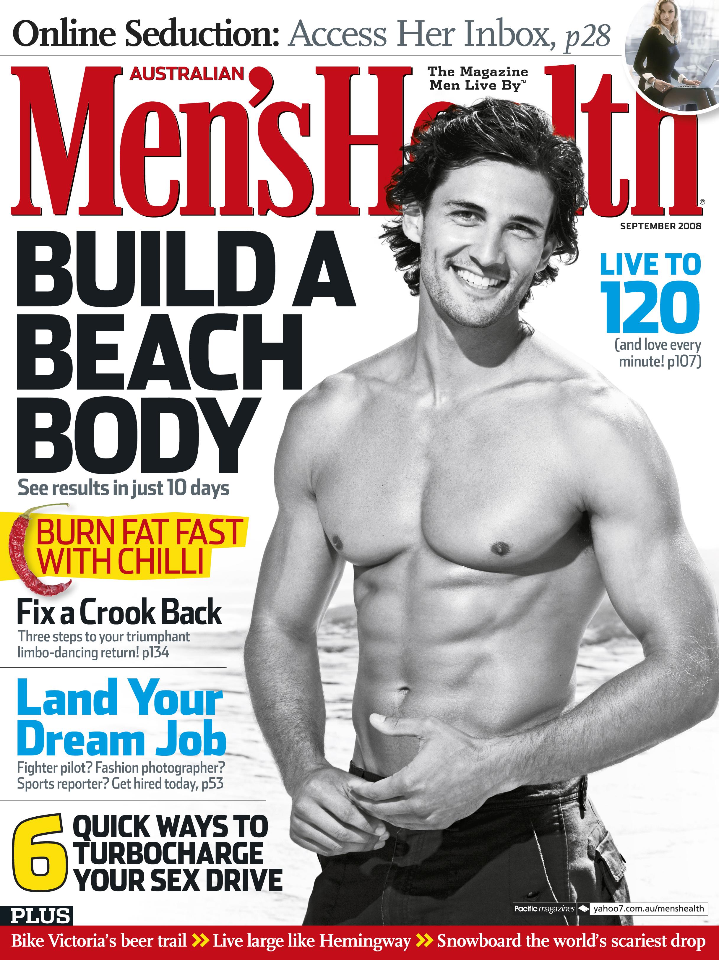
Men's Health is a self explanatory magazine, aimed at men with a health-orientated mentality. The front cover features strong, bold colours - red, blue, white and black, with some uses of a neon yellow. These are primary colours, with red bringing connotations of strength, blood, masculinity and passion. 
Masthead

The masthead is in a bold, bright red font, which make it stand out drastically against the white backdrop. The name of the magazine, 'Men's Health' is self explanatory, with the reinforcement that this is a magazine aimed for men. It seems to be a rather well known magazine, as the main image of the front cover overlaps the masthead, a feature found in the more known magazines.
Main Image
The main image of this front cover consists of a well-built young man, smiling at the camera and viewer. The man is wearing swimming shorts, and the beach waves seen in the background reinforce the context. The man's body (especially abs) are shown off, as a body with defined muscles is a sign of health, vital for this magazine of which health is a main focus. It may also be to advertise the main cover line 'Build a beach body', with the model in the main image acting as an example. Interestingly, the photograph is black and white, instead of in colour. This may be to make the use of colourful fonts grab more attention from the viewer than the photo.
Cover lines and puffs
The main cover line for this front cover is 'Build a beach body', in a black, bold font and capital letters. It anchors the main image, where the model is in a beach setting. It also goes together with the monochrome palette of the main image. The puffs on this front cover feature a lot of plosive and dynamic words, which reinforce the target audience for this magazine - it is stereotypically assumed that men enjoy action, violence and power, and words such as 'burn' and 'turbocharge' add a punch to reading the cover lines. The 'burn fat fast with chilli' is a cover line which raises enigmas and hooks the reader in, as they are intrigued to know how chilli can burn fat. It also adds to the stereotypical assumption that men would eat spicy food, and chilli is an extreme example of such food. The cover line at the bottom of the cover, '6 quick ways to turbocharge your sex drive' attracts the reader's attention as it satisfies all four criteria of the uses and gratifications theory to some extent: the cover line uses a direct mode of address to the reader, and supports the personal identity criteria of the theory; it promises information on improving sex to be more enjoyable, which then allows the reader to talk about these '6 ways' to their friends by making them feel superior for having such knowledge. The audience of the magazine is shown through this cover line to include men who are in a relationship, and possibly married. One more puff I found interesting is 'fix a crook back', which widens the audience the magazine is aiming at, as men who are more likely to have back problems would be of an older age. And unlike the other puffs which focus on physical appearance, this one mediates more around overall health, helping the magazine to stay true to it's masthead.
It's worth noting that the puffs focus on only the reader: for example, the 'build a beach body' doesn't include text to suggest that it will help the reader gain attention of the opposite sex, and the '6 ways to turbocharge your sex drive' cover line doesn't focus on improving the sex life for the partner as well as the reader. Thus, it may be argued that the magazine is subtly aimed at more self-centered people. However, this could be argued with the cover line 'live to 120 (and love every minute!)' which contradicts this. This cover line strongly supports loving life and oneself, and promotes for the reader to gain more self esteem. So it also shows that this magazine intends to attract the attention of those who wish to be not only healthy on the outside, but maintain their mental heath in good condition as well, for men who both feel confident, or wish to feel more confident about themselves.

Wednesday 2 October 2013

Front Covers - Women's magazine

Vogue is a fashion magazine aimed at a female audience. This issue consists of feminine, pastel colours. The text is black and hot pink to contrast against the delicate teal colour in the background. The colours, pink and the soft teal, are spring colours (cherry blossoms and grass) which go together with the month in which the issue was released, March.

Masthead
Vogue is a recognizable brand and therefore the whole text doesn't have to be seen for the audience to recognise it. Lady Gaga's head blocks a part of the masthead, which makes her stand out more out of the cover, and her face attracting a lot of attention from the viewer as her face lacks any distracting text over it.

Main Image
The main image is Lady Gaga, the star of this issue's front cover. She is wearing a robe of some sort, revealing her cleavage and leaving her shoulder exposed. She's standing straight up, with her hands on her hips and facing the viewer directly, showing confidence and also promoting her slim figure. She wears little amount of makeup, which is unusual for her, as she is often seen wearing heavy eyeliner and unusual clothing, but she retains her unique, attention grabbing style with her pink bob hairstyle and dark lipstick. The dark lipstick links the image to the anchoring puffs and masthead, which are also dark in colour. This allows the image to contrast against the dark text, but not clash completely against the surrounding dark fonts.

Cover lines and puffs
Vogue doesn't bombard the viewer with too many puffs on the front cover, as this would eliminate the sleek and sophisticated look. The main cover line is Lady Gaga's new album 'Born This Way'. It further intrigues the viewer into buying the magazine, especially if the viewer happens to be a fan of her music. The feature of her new album supports the Uses and Gratifications Theory's information needs within the audience, as the article would consist of plenty of information on the album. The title of her album promotes self esteem and love for oneself, which also links to Vogue's association with body image, and fits into the personal identity needs within the magazine's audience. This is because the majority of women who read this magazine would like to be as confident and successful as her, and the front cover leads to believe that reading the article would help the audience to reach those goals.
The other puffs feature women less known to us, but they are all women of power. 'Cry Freedom' is about a woman who lived 29 years in a cult - though the line is vague, the connotations of 'cult' and 'freedom' clash, which suggests that the woman this cover line relates to is a hero for being free, fighting for freedom, living in a cult for so long, or possibly freeing herself from a cult. 'Starved for Love' is a cover line with connotations of anorexia - personifying the 'food demons' makes the mother and daughter also sound heroic. It strongly leads to the topic of self-esteem, as Vogue here is trying to applaud the survivors of eating disorders, and links back to loving oneself. Magazines like Vogue are well known for triggering people to anorexia and bulimia, and how this cover line portrays the mother and daughter as heroic, shows that the magazine is standing against such claims and tries to promote a more positive message.