http://www.channel4.com/programmes/my-mad-fat-diary/4od
My Mad Fat Diary
In this programme, the protagonist named Rae Earl, is an overweight teenage girl who has recently left a psychiatric ward. The episode above begins with her narration on her losing her virginity, as well as the morning after it happened.
From these first three minutes, the programme seems to present her very realistically in the role of a teenage girl - arguably too realistically, as teenagers in TV are usually beautified to some extent with the use of make up or flattering clothes to make them look more attractive, but in the case of Rae there is no obvious appearance of make up, her hair the morning after appears to be more messy than it would normally be portrayed on television, and her clothes are very simple, modest and dark - not bright and cheerful which teenagers are usually presented to wear. On one hand, this is a fairly positive representation, as it normalises the appearance of a teenage girl without touch-ups to the audience which allows teenagers alike to personally identify with Rae and also allows the show to focus more on her experiences and feelings rather than looks, which helps in humanising her character as more than just a 'fat chick'. However, it can be argued that her plain appearance in the show doesn't help in representing overweight people on television in a positive way, as her features are not celebrated in the way they potentially could be. This kind of representation supports the negative stereotype that fat people cannot be attractive. It is impossible to deny that Rae's weight isn't a vital part of the plot, as even the show's title is a reference to her weight. However, the show tries to side the audience onto Rae's side of any conflicts and uses her experiences to provide information to what it is like to be an overweight teenager.
Friday, 28 March 2014

Wednesday, 5 February 2014
The Cultivation Theory
The Cultivation Theory states that the more a person is exposed to the media portrayed in television, the greater its effect is on the person's judgement on the world, based on what they are exposed to. It affects the viewers in a passive rather than an active way, influencing the peoples' attitude to the world rather than their behaviour towards it. Gerbner and Gross - who coined the theory - suggest that television has the same power over society in the modern day as religion has had in earlier times.
One of the most common examples of the cultivation theory in practice is the urban belief that violence in youth that is shown on the news stems from violence shown on TV and video games. However, because the cultivation theory suggests that the effects of TV are more passive than active, it argues against this belief. Implying the cultivation theory into this belief would suggest that those affected by the exposure to media are not the violent individuals but those who support and believe it. This is because the portrayal of violence on TV involves a focus on youths and represents youths more commonly in a negative way rather than a positive one, and violence on TV itself has become more accepted by society over the years, as viewers become more immune to its primary purpose of shocking the audience. With the strong link between youth and violence in the media, people grow up accepting these stereotypes as fact, because that is what they are exposed to from the earliest stages of their life. This alters the views of of people towards youth in the real world, as it can cause people to judge and fear teenagers and youths in public in case they have an outburst of violence, as that is how the media has portrayed them.
The site citation.allacademic.com points out that 65% of video games feature violence as bloodless and and frequent, and in a way which disregards its long-term effects on others; thus normalising it amongst video game players. And though articles like this one argue against the popular belief on certain crimes committed by young people to be influenced by video games, statistics such as the former have been accepted by the public to be a factual correlation with crime, when it could mostly be coincidence. There are books written as early as 1999 (Stop Teaching Our Kids To Kill by Lt. Col. David Grossman) which stirred controversy on the subject, and Grossman has defended his opinion by describing first-person shooter games as "murder simulators"- proving that this urban belief has already been around even in the early days of the timeline of video games. The article on the Sandy Hook shooting is as recent as 2013 and the proof in the long-term effects of the cultivation theory is evident in how the police had to make an official statement to the public to decline the statement that has been reinforced by a national outcry whose beliefs stem from the reinforced negative representation of young people.
One of the most common examples of the cultivation theory in practice is the urban belief that violence in youth that is shown on the news stems from violence shown on TV and video games. However, because the cultivation theory suggests that the effects of TV are more passive than active, it argues against this belief. Implying the cultivation theory into this belief would suggest that those affected by the exposure to media are not the violent individuals but those who support and believe it. This is because the portrayal of violence on TV involves a focus on youths and represents youths more commonly in a negative way rather than a positive one, and violence on TV itself has become more accepted by society over the years, as viewers become more immune to its primary purpose of shocking the audience. With the strong link between youth and violence in the media, people grow up accepting these stereotypes as fact, because that is what they are exposed to from the earliest stages of their life. This alters the views of of people towards youth in the real world, as it can cause people to judge and fear teenagers and youths in public in case they have an outburst of violence, as that is how the media has portrayed them.
The site citation.allacademic.com points out that 65% of video games feature violence as bloodless and and frequent, and in a way which disregards its long-term effects on others; thus normalising it amongst video game players. And though articles like this one argue against the popular belief on certain crimes committed by young people to be influenced by video games, statistics such as the former have been accepted by the public to be a factual correlation with crime, when it could mostly be coincidence. There are books written as early as 1999 (Stop Teaching Our Kids To Kill by Lt. Col. David Grossman) which stirred controversy on the subject, and Grossman has defended his opinion by describing first-person shooter games as "murder simulators"- proving that this urban belief has already been around even in the early days of the timeline of video games. The article on the Sandy Hook shooting is as recent as 2013 and the proof in the long-term effects of the cultivation theory is evident in how the police had to make an official statement to the public to decline the statement that has been reinforced by a national outcry whose beliefs stem from the reinforced negative representation of young people.
Monday, 3 February 2014
Representation of age in the media
Older peoplehttp://www.dailymail.co.uk/femail/article-2550656/FOREVER-BEAUTIFUL-Make-turn-clock.html
In this article, the representation of age is shown as negative. It is an article on beauty, aimed mainly at women, as it was featured on the 'femail' section of The Daily Mail. It's about the 'secrets', tips and tricks on looking more youthful with the use of makeup, and the title 'forever beautiful' suggests that old age is not a connotation of beauty, but youth - which isn't eternal - is. Wrinkles are an obvious sign of ageing and they are described as 'age-related issues' which need to be fixed, and the fact that a completely natural process is described as an 'issue' reinforces a very negative and self-loathing connotation of age amongst women.
Younger peoplehttp://www.dailymail.co.uk/tvshowbiz/article-2547425/Justin-Bieber-set-arraigned-Miami-DUI-Vanlentines-Day.html
This article is about the young celebrity Justin Bieber and the follow up of his arrest for driving under the influence. The article describes Bieber in a negative and immature way as the writer antagonises him by listing his charges, then follows it with "Meanwhile, the 19-year-old has been looking like he doesn't have a care in the world as he frolicks on a beach in Panama with his entourage." This makes Bieber sound irresponsible and spoilt as it creates the impression that he has gotten away with his crimes for being rich and famous since he isn't currently in jail. However, the focus on his upcoming arraignment makes it sound like an event worth looking forward to as it may result in potential punishment for Bieber, and thus creates a negative ideology where the reader is encouraged to look forward to the punishment of a young person. The ideology conveyed in this article reinforces the stereotype that young people are troublemakers and irresponsible.
Friday, 31 January 2014
Representation of Gender in the Media
Female Representation1) A sexualised, objectified female in advertising - Grand Theft Auto 5 promotional art
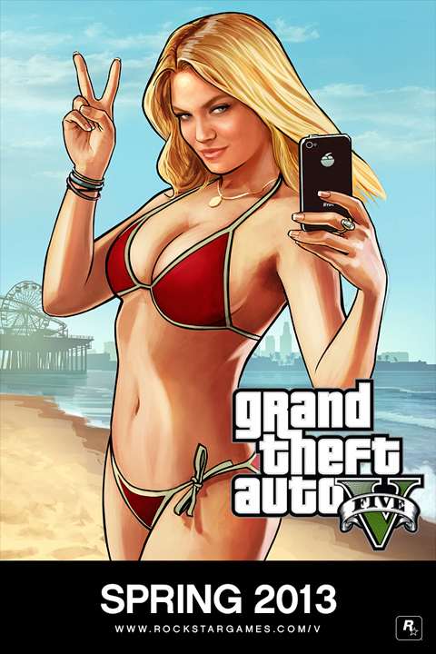
This advertisement consists of a long shot of a white, blonde, young woman in a bikini, posing with her phone. This poster has been the poster most commonly used to advertise GTA 5, most likely since its controversial nature would bring attention to the franchise before the game's release. Her bikini exposes most of her skin, and the red colour brings attention to the only parts of her body that remain covered. She fits the stereotype of an attractive woman, as she's visibly thin, has flawless skin, large breasts, small facial features, a gentle tan and long blonde hair. The focus of the viewer's gaze is aimed for her chest, as the position of her in the photo places her chest to be in the centre of the image. The only way in which the poster links back to the objective and plot of the game is the background, which matches the setting of the fictional city based on Hollywood. However the woman who is the main focus of the poster doesn't seem to show any particular relevance to the storyline.
2) Domestic woman in a film or TV show - Lois Griffin from Family Guy

The demographic audience for Family Guy consists mainly of Americans of the C and lower socio economic demographics, with a narrower focus on teenagers and youth of both genders. Family Guy is a sitcom, and therefore has an episodic plot, almost always focusing on the Griffin family, of which Lois Griffin is a member of. She is the wife of Peter Griffin and the mother of their three children. Her portrayal throughout the series is mostly shown to be a carer for Stewie, the youngest child, as a full-time mom. She is a white, ginger woman, with a curvy figure and she's usually seen wearing red lipstick, earrings, a teal shirt, beige trousers and flat shoes - which suggests a casual appearance leaning onto a formal side. Aside from her large nose, her features are typical of a stereotypical suburban mother, as she isn't portrayed in a neither an attractive or unattractive way, though her lipstick and earrings might suggest that at least she tries to look nice.
As her job as a mother is mostly centred around taking care of the baby, she isn't seen out of the house as often as the other family members throughout the show. Her appearances and gags are often focused around housework and nurturing the needs of Stewie and her lazy husband Peter. Her role in the show seems to also focus on being the one to whom the other characters turn to for advice, which further stresses her portrayal as a stereotypical woman and mother - maternal, mature and understanding.
3) Post Feminism - Lilly Allen's "Hard Out Here" (2013)
Post feminism: Music Video: Lily Allen – Hard Out Here
The video begins with a scene where the singer is undergoing
a liposuction. As a man in a suit, looking over her operation spews negative
comments about what brought her to the hospital bed, she answers back with ‘I
had two babies’, but is ignored. A television screen showing dancers wearing
revealing clothes is also shown as part of the mise-en-scene.
The scene shifts to her dancing with the same dancers as
shown before, as she sings the chorus ‘It’s hard out here / For a bitch it’s
hard’, which is meant to represent how hard it is to be a woman in today’s
patriarchal society. Some other lines in the song include ‘Forget your balls
and grow a pair of tits’, which is a collocation clash to emphasise her
intention to surpass males in the song and video. By ‘forget your balls’, she
is disregarding the importance of men to encourage the message that females are
just as important and tough as men, but it may also encourage men to see
society from a woman’s point of view.
One of the most influential scenes of the music video is
near the end, as Lily Allen is shown in the foreground of a bunch of balloons
which spell out ‘LILY ALLEN HAS A BAGGY PUSSY’ which is a clear reference to a
similar scene of Robin Thicke’s ‘Blurred Lines’ and the controversy that it has
caused earlier within the year for its sexist lyrics and motifs – the inclusion
of this scene in Allen’s video is a backlash at the encouragement of date rape
and further stresses the feministic theme of the song.
Lily Allen’s demographic would be assumed to be fans of her
music from the late 2000’s when she debuted. After taking a hiatus from music
at about 2009, she came back in 2013 with this song, which possibly caused a
shift in her demographic to a more female-focused one, as her new feminist-centred image has likely pushed away some of her male fans who struggle to agree with her views.
Monday, 27 January 2014
Mock Exam Improvement
In my mock exam which I have sat in January, I received 27 marks for Q1, a total of 17 marks for Q2, and 17 marks for Q3, with my final grade in the mock adding up to a low C.
Audience Question
- Be specific when mentioning age groups within the target audience of a media text: instead of generalising an age demographic (e.g. young girls, teenage boys, older men and women), mention a specific age group, e.g. young girls between the ages of 15 and 25
- Develop my answer further and add more detail
Representation Question
- 'Your own detailed examples' in the question refers to detailed research and must refer to specific media texts: different media texts such as an advert vs a magazine front cover may present the same person in different ways, so the mention of a particular representation of a person must include an example of the media text which presented them in this way
- When mentioning connotations, justify why they have been used
- Denotation = the item; Connotation = the meaning behind the used item
- Mention the use of language in the media text more often
Revision and StudyTo improve my revision, I think I should focus more on memorising the media terms and revise the theories more, so I have a deeper knowledge of them and can use them in my answers more fluently. I should also learn to apply the relevant theories into different media texts. Another way to improve my revision is to link the use of media and technical terms back to their connotations more often.
CourseworkFor my coursework I believe that the aspect I could improve the most on is the report, as I should focus on the most relevant features within my textual analysis and my magazine product in my writing. I could have also put more focus on the questionnaire, as I haven't used its results as prominently within my research at the start of the coursework as I should have done.
Monday, 9 December 2013
PRODUCTION: double spread final draft
For my final front cover, I have chosen the winter issue out of the two front covers I made, and the double page spread is loosely based on the winter front cover - what mainly links the two are the main images i used for the front cover and double page spread of my magazine, where the model is wearing the same clothes in both. The main cover line on the winter issue also links back to the double page spread's article, as both are about the same person.


(The faint guideline in the centre indicates where the page would be folded if it was printed)
This double page spread from INDIE magazine is what I heavily based my double page spread on:

However, I was only able to copy the aesthetic conventions of the above double page spread: my article text was improvised as I found the text in INDIE's article too small to read for me to have a basis on what to write. In my article, I considered that the target market of PIXIE, like in the case of INDIE, are young individuals of both genders from a higher economical income. Many of these young people interested in fashion who would read magazines like INDIE would run their own blogs on sites such as Tumblr, Blogger or Pinterest. This is why I have used a fair amount of lexis which is often used on such sites, as it makes the magazine seem up-to-date in terms of the latest trends, as well as interactive with these social media communities.
Friday, 15 November 2013
PRE PRODUCTION: Front cover final draft
As you may know, my magazine is called 'Pixie', and here they are: the summer issue and winter issue.


EDIT 09 / DEC / 2013: I edited the errors in the summer issue of the front cover, including the small 'S' near the main cover line that wasn't meant to be there. I also changed the main cover line font and text, as I felt that the exclamation mark doesn't go with the genre of magazine which my front cover is based upon. The new font is much bolder and easier to read, and the use of italics make it look more 'indie' and unique. I changed it to 'OLD SCHOOL' as it reflects the vintage-inspired, indie fashion often featured in magazines like these, and because it's a recognisable collocation. Additionally, I felt the colours of the first draft weren't warm enough, so I slightly altered the main image with the use of curves as well as lowering the contrast - which gave the photo warmer undertones to reflect the season of the issue.

Monday, 4 November 2013
Questionnaire!
If you have some time to spare, feel free to fill in my questionnaire for my AS media coursework! It will help me out a lot, and your answers are completely anonymous!
Click here for the questionnaire!
Click here for the questionnaire!
Wednesday, 23 October 2013
First draft front cover

For the genre of my front cover, I picked a higher-brow women's fashion magazine, with inspiration taken from the likes of Nylon, Indie, and Topshop magazine. The masthead I chose is 'Pixie' - it relates to the alternative 'pixie cut' hairstyles associated with more fashionable young women, and it is also a reference to the font it is written in, a pixel font. I think it's effective for this magazine as I feel that pixels and pixel fonts have connotations of video games, youth, punk/grundge, individuality, simplicity and retro. The chunky, 'bubbly' shape of the letters were inspired by the Nylon masthead, and also give the magazine a nostalgic and cute image, which goes well with the intended audience of the magazine being young girls and women from the ages of 16-25 who would possibly dress with cute and bubbly trends in mind.
I based the white frame of the magazine (which isn't very visible on here) on the layout present in every Topshop magazine which has been released since I was aware of its circulation. I feel that the frame works well with the white masthead and contrasts against the darker brick wall background, to give the front cover a sense of balance in colour. It's also sharp and clean-cut, which again contrasts against the brick wall's rough and heavy texture. All of this effectively make the front cover look individual, which is a vital feature of Indie's image in the press.
I was aiming to feature a minimal amount of cover lines, just like Indie usually does. However, I felt that the image I used was not enough to make a statement, so I added two additional cover lines to fill the space on the right. I also shifted the model slightly to the left, so her body fits better into the rule of thirds. I also did this to take a different approach from most magazine front covers which would place the model in the centre, to further strive for an individual overall image of the cover.
The main cover line is focused on the model, and is also written in a pixel font, to balance out with the masthead across the top of the cover. I featured only the model's first name, so it evokes a sense of familiarity amongst the model's fans. Because the main cover line text wasn't easy to read on it's own, I added a brush stroke underneath to make it easier to read, which resembles graffiti and adds onto the individual, youthful image even further.
Wednesday, 9 October 2013
Magazine Front Cover Analysis
For my coursework, I decided to focus on making a magazine front cover. I decided to focus on the women's style/fashion magazine.

This magazine is named after it's independent, quirky theme. There is only one cover line used here, and it's ambiguous, but assumably relates to the girl in the main image. The minimal amount of puffs used shows that this magazine aims for an image amongst the high brow magazines on the market. This is because many of these higher-end magazines would focus more on the image than the text, so the headline looks less cluttered, but prettier. The text is also juxtaposed in a way - whilst the font of the masthead is sans serif and clean-cut, the coverline is in a script, handwritten font. They are also placed opposite to each other on the cover.
The issue is of winter 2010/11, and the cool colour scheme of the front cover reflect this. The texts used are all in white, as if they represent snow and cold weather.
The main image is a girl wearing a wooly jumper. Her clothing fits the season of the issue's publish date. The photo is a close up shot, so the magazine isn't trying to sexualise the girl by over exposing her body in any way - not only is she covered by the jumper she's wearing, her hands are covering her body as well. This approach is the opposite to what most style magazines tend to do, where they take full body shots to show off the model's body and clothes. This daring approach also reflects the independent image of this magazine. The background of the main image is of a pale blue colour, and looks vintage and worn. Again, it supports the image of what the viewer would believe an indie magazine would have elements of.
This front cover follows the rule of thirds effectively. Not all blocks of the rule of thirds are occupied, however, the masthead, face, barcode and coverline all fit into their own blocks in the rule of thirds, seperating each element from each other to provide the viewer with something to look at, no matter which of the thirds they are to focus on.

Nylon is a lifestyle magazine, mainly aimed at older girls and young women of a higher social economic income. Though not as simplistic as Indie, Nylon also has elements of an individual and high end image. There are multiple puffs on this issue, all framing Ashley Olsen in the main image. The masthead is baby pink, unlike any of the coverlines which are in either white, red or yellow, which reinforces the main audience for the magazine with its feminine hue. The font looks modern, as it's very bold and contains clean cut, simple lines. The main coverline is of Olsen's full name, anchoring the image of her sitting on a bench. 'Un-zipped' suggests that inside, the issue contains an article about Olsen's life, specifically her secrets or less well known facts about her. This sparks curiosity within the audience, especially if they are fans of Olsen, or grew up to films and TV shows she starred in. The font in which this coverline is written in (as well as the '154' in "154 ways to get your jeans on") looks like capital letters with a scribbled outline, which allow the background (and a part of Olsen's leg on the left side) to shine through. This font also has a casual, quirky and school-like appearance to it.
The main image is Ashley Olsen, one of the Olsen twins famous for acting and singing. She is usually seen with her sister Mary Kate in the media, but on the cover of this issue she is on her own - it's as if Nylon is trying to deliver a message that she's an individual, which would grab the viewer's eye for the unusual lack of Mary Kate's presence. The photo is a full body shot of her sitting down, and it effectively shows off her clothes without sexualising her and still maintaining Olsen in an interesting pose, all at once. Olsen is wearing darker tinted clothes and a bright orange beanie. The beanie and skinny jeans she's wearing are usually associated with laid back young people who wear such clothes on a normal day. Her pose is rather casual too, and she is looking directly at the viewer with a neutral facial expression. Her head overlaps the masthead (showing that the magazine is well known and recognisable, and to make her the dominant element of the front cover) and interestingly the background is rather busy for a magazine. Complimenting the dark tones of Olsen's clothing, the background is of a dark, metal gate/fence. It adds onto this 'punk'-like theme of the issue.

This magazine is also aimed at females with a high social economic income, but unlike Indie and Nylon, it has a slightly more mature vibe and feel to it. The masthead is a bold, tall font. This magazine is not as well known and thus the masthead is placed over the model. The
Friday, 4 October 2013
Front Covers - Men's magazine
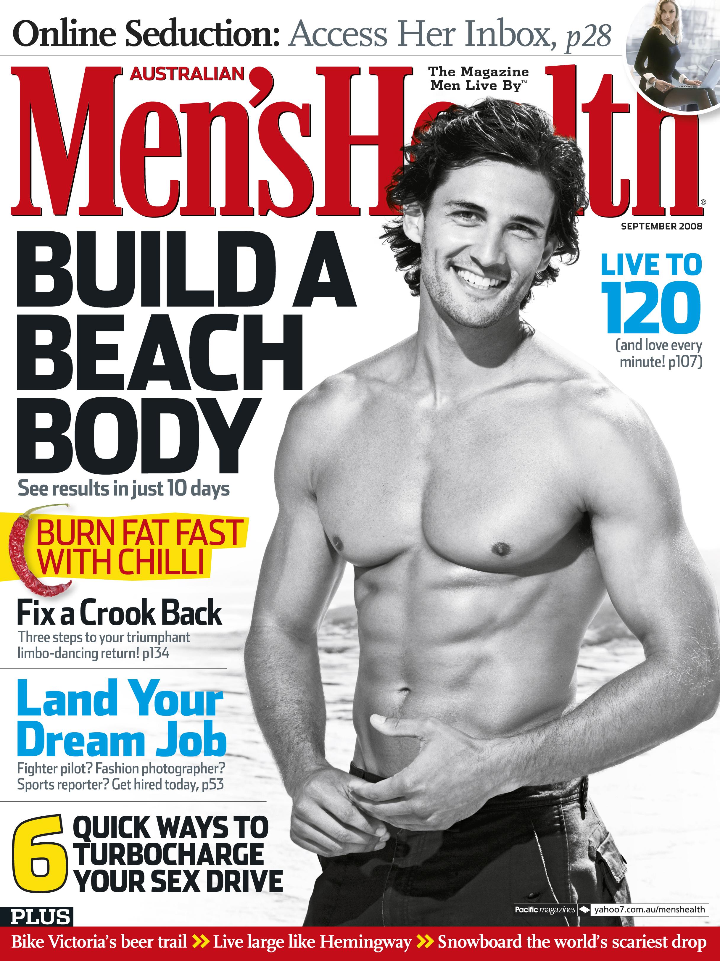
Men's Health is a self explanatory magazine, aimed at men with a health-orientated mentality. The front cover features strong, bold colours - red, blue, white and black, with some uses of a neon yellow. These are primary colours, with red bringing connotations of strength, blood, masculinity and passion.
Masthead
The masthead is in a bold, bright red font, which make it stand out drastically against the white backdrop. The name of the magazine, 'Men's Health' is self explanatory, with the reinforcement that this is a magazine aimed for men. It seems to be a rather well known magazine, as the main image of the front cover overlaps the masthead, a feature found in the more known magazines.
Main ImageThe main image of this front cover consists of a well-built young man, smiling at the camera and viewer. The man is wearing swimming shorts, and the beach waves seen in the background reinforce the context. The man's body (especially abs) are shown off, as a body with defined muscles is a sign of health, vital for this magazine of which health is a main focus. It may also be to advertise the main cover line 'Build a beach body', with the model in the main image acting as an example. Interestingly, the photograph is black and white, instead of in colour. This may be to make the use of colourful fonts grab more attention from the viewer than the photo.
Cover lines and puffsThe main cover line for this front cover is 'Build a beach body', in a black, bold font and capital letters. It anchors the main image, where the model is in a beach setting. It also goes together with the monochrome palette of the main image. The puffs on this front cover feature a lot of plosive and dynamic words, which reinforce the target audience for this magazine - it is stereotypically assumed that men enjoy action, violence and power, and words such as 'burn' and 'turbocharge' add a punch to reading the cover lines. The 'burn fat fast with chilli' is a cover line which raises enigmas and hooks the reader in, as they are intrigued to know how chilli can burn fat. It also adds to the stereotypical assumption that men would eat spicy food, and chilli is an extreme example of such food. The cover line at the bottom of the cover, '6 quick ways to turbocharge your sex drive' attracts the reader's attention as it satisfies all four criteria of the uses and gratifications theory to some extent: the cover line uses a direct mode of address to the reader, and supports the personal identity criteria of the theory; it promises information on improving sex to be more enjoyable, which then allows the reader to talk about these '6 ways' to their friends by making them feel superior for having such knowledge. The audience of the magazine is shown through this cover line to include men who are in a relationship, and possibly married. One more puff I found interesting is 'fix a crook back', which widens the audience the magazine is aiming at, as men who are more likely to have back problems would be of an older age. And unlike the other puffs which focus on physical appearance, this one mediates more around overall health, helping the magazine to stay true to it's masthead.
It's worth noting that the puffs focus on only the reader: for example, the 'build a beach body' doesn't include text to suggest that it will help the reader gain attention of the opposite sex, and the '6 ways to turbocharge your sex drive' cover line doesn't focus on improving the sex life for the partner as well as the reader. Thus, it may be argued that the magazine is subtly aimed at more self-centered people. However, this could be argued with the cover line 'live to 120 (and love every minute!)' which contradicts this. This cover line strongly supports loving life and oneself, and promotes for the reader to gain more self esteem. So it also shows that this magazine intends to attract the attention of those who wish to be not only healthy on the outside, but maintain their mental heath in good condition as well, for men who both feel confident, or wish to feel more confident about themselves.
Wednesday, 2 October 2013
Front Covers - Women's magazine


MastheadVogue is a recognizable brand and therefore the whole text doesn't have to be seen for the audience to recognise it. Lady Gaga's head blocks a part of the masthead, which makes her stand out more out of the cover, and her face attracting a lot of attention from the viewer as her face lacks any distracting text over it.
Main ImageThe main image is Lady Gaga, the star of this issue's front cover. She is wearing a robe of some sort, revealing her cleavage and leaving her shoulder exposed. She's standing straight up, with her hands on her hips and facing the viewer directly, showing confidence and also promoting her slim figure. She wears little amount of makeup, which is unusual for her, as she is often seen wearing heavy eyeliner and unusual clothing, but she retains her unique, attention grabbing style with her pink bob hairstyle and dark lipstick. The dark lipstick links the image to the anchoring puffs and masthead, which are also dark in colour. This allows the image to contrast against the dark text, but not clash completely against the surrounding dark fonts.
Cover lines and puffsVogue doesn't bombard the viewer with too many puffs on the front cover, as this would eliminate the sleek and sophisticated look. The main cover line is Lady Gaga's new album 'Born This Way'. It further intrigues the viewer into buying the magazine, especially if the viewer happens to be a fan of her music. The feature of her new album supports the Uses and Gratifications Theory's information needs within the audience, as the article would consist of plenty of information on the album. The title of her album promotes self esteem and love for oneself, which also links to Vogue's association with body image, and fits into the personal identity needs within the magazine's audience. This is because the majority of women who read this magazine would like to be as confident and successful as her, and the front cover leads to believe that reading the article would help the audience to reach those goals.
The other puffs feature women less known to us, but they are all women of power. 'Cry Freedom' is about a woman who lived 29 years in a cult - though the line is vague, the connotations of 'cult' and 'freedom' clash, which suggests that the woman this cover line relates to is a hero for being free, fighting for freedom, living in a cult for so long, or possibly freeing herself from a cult. 'Starved for Love' is a cover line with connotations of anorexia - personifying the 'food demons' makes the mother and daughter also sound heroic. It strongly leads to the topic of self-esteem, as Vogue here is trying to applaud the survivors of eating disorders, and links back to loving oneself. Magazines like Vogue are well known for triggering people to anorexia and bulimia, and how this cover line portrays the mother and daughter as heroic, shows that the magazine is standing against such claims and tries to promote a more positive message.
Friday, 27 September 2013
Textual Codes - Bad Education
Narrative and GenreThis programme is of the sitcom genre. The particular episode is titled 'Drugs' and like the name suggests, it is about educating the school's students about drugs.
The show contains a running gag of Alfie's immaturity contrasting against his workmates and students - in fact, this gag is central to the plot as it results in him getting into all sorts of awkward and difficult situations. In this episode, this running gag is included into the narrative as he mixes up his knowledge of known drugs during his conversation with Rosie, showing he has no basic knowledge of the subject. Rosie's reaction to the majority of Alfie's dialogue is disbelieve or disagreement, to further highlight the difference between Alfie and the rest of the cast, showing him in a negative way.
The lack of maturity in Alfie's behaviour is one point which reflects his main mediation of representing a 'bad teacher', and that is what's highlighted by the contrast of Alfie's personality versus the behaviour of other characters in the programme. This also is what puts him into different situations, breaking the equilibrium of the plot (with Alfie usually being the catalyst) and amusing the audience as he's shown as an incompetent teacher.
Visual CodesAlfie is shown wearing mostly grey clothes in this episode: a strange looking parka jacket, a brown satchel, and bright green trousers. His appearance is far from the professional attire a teacher would wear - it shows Alfie doesn't take himself too seriously, or he isn't very fashion orientated. Nonetheless, it adds a lighthearted atmosphere to the programme.
Technical CodesBright lighting is used in Bad Education, as it is the sitcom genre, thus it is aiming at a more friendly atmosphere. The bright lighting makes the audience feel safe and welcome.
Thursday, 19 September 2013
Uses and Gratifications: The Big Bang Theory
For Uses and Gratifications, I will be writing about The Big Bang Theory, an American sitcom about four scientists and their next door neighbour Penny. I believe that this show applies this theory well amongst its audience.

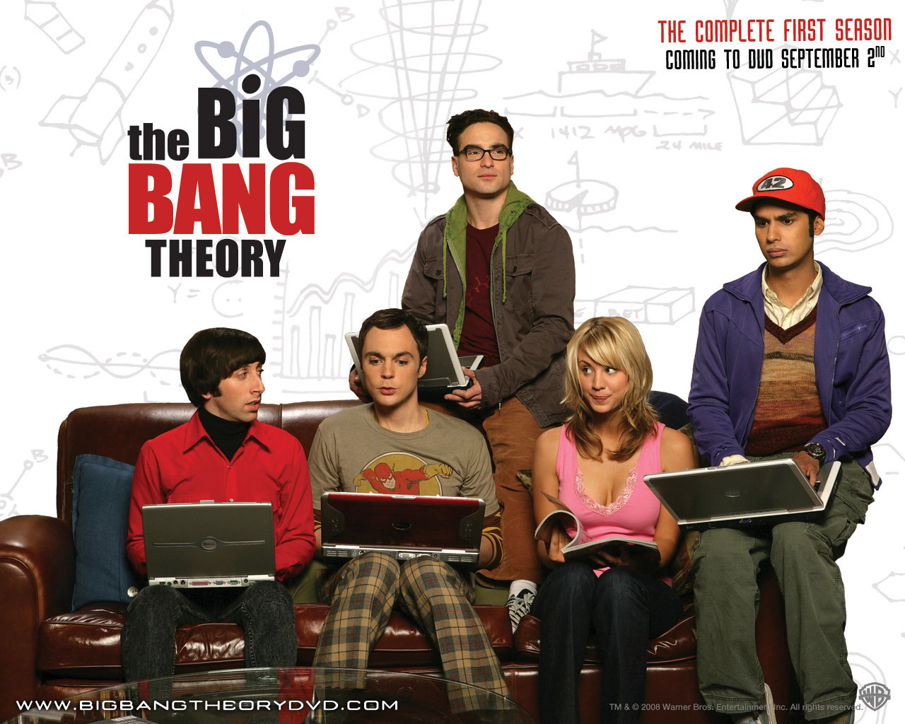
Personal IdentityThe Big Bang Theory applies the use of personal identity amongst their audience, which consists of a younger audience of fairly intelligent people. The audience identify themselves as intelligent, because the show's rather uncommon vocabulary and the dialogue being based around jargon of the protagonists' occupations is occasionally understood by them, giving the audience a sense of satisfaction because "they must be smart", due to their ability to understand the "big words" used in the show. The Big Bang Theory is not aimed as much at genuine scientists. This is because if it was, the use of actual jargon of the scientific profession would be too difficult for the main audience to comprehend, instead making them feel "stupid" and pushing them away from the show, excluding them. The show's goal is not to be scientifically or politically correct, but to make their audience feel smarter and more superior for understanding the "science" and "geek" jokes, which is why the scientific dialogue is simplified to achieve this effect.
InformationThe Big Bang Theory includes many references to popular culture, and both past and current events within their gags and jokes. It allows those who already knew of the event to relate to the characters of the show, and inform those who were not aware of the event mentioned. The characters of the TBBT are 'geeks', so news related to comics, gaming and science are the topics most often covered. It again allows those who are involved in such hobbies to relate to the characters, and inform those who are not aware of the topics as much. Penny's role in the show is to be 'stupid' so the other characters would explain the topics to her in a more 'simple' way. This is used to also explain the topic to the audience, so they may feel like they also have a part in the conversation.
EntertainmentThe audience of The Big Bang Theory watch the show for its ability to entertain them, as it gives them an emotional release. This is done by belittling Sheldon, Leonard, Penny and the other characters to give the audience a feeling of superiority. The smarter characters are laughed at by the laugh tracks for their hobbies, as their interest in things such as comics and games for children are the gags themselves. Penny, on the other hand, is ridiculed for not being able to understand the scientific jargon, and her exclusion from the group for this and for working in a low wage job is also a running gag of the show. Of course, both of these examples are not the best way to deliver entertainment, as it makes those who can relate to the characters for the same things these characters are ridiculed for, feel belittled as well. However, the show is in fact aimed at those who wish to feel smarter and this is entertaining to such an audience because the show is bullying the characters in their behalf, so the desired audience doesn't feel guilty for this.
Social IntegrationThe Big Bang Theory's coverage on topics such as recent scientific breakthroughs and events within geek culture give the audience an insight onto topics they don't usually find on the headlines of papers and news programmes. This 'underground' knowledge gives the audience an insight into topics they would normally ignore or not understand, making them feel and seem more intellectual to those involved in the conversation. The Big Bang Theory is a currently running programme on E4, a popular British channel with a large, young audience; allowing conversations about the show itself popping up amongst groups of friends. It makes sense that a member of such a group would tune in to watch this programme after it being mentioned or recommended by friends, as its plot focuses on outcasts of society, an uncommon and unique plot amongst television programmes (which also maintains successful). The plot is seemingly broad and may give off many expectations to a new viewer.
Construction, Selection, MediationTBBT is filmed in a sitcom, episodic style, and in front of a live audience. Most of the story takes place in Sheldon's and Leonard's apartment and the overall apartment block, but it's actually a built filming set, and not a real apartment. Existing bloopers prove that certain scenes are selected to make the final cut. The mediation of individual episodes usually varies depending on the events within the storyline, but the overall idea remains: the protagonists and the juxtaposition of their geeky and socially awkward personalities versus the desired characteristics within the society they inhabit is the main mediation of the plot, with Penny acting as a representation of the latter.
How the media has shaped you? - Class
How the media has shaped the representation of class?
I found a youtube clip from a breakfast show a while back, which clearly represented class differences in the UK. It featured an interview of Katie Hopkins, who was asked on her opinion about certain baby names.
Hopkins is an example of what could be considered of upper class due to her celebrity status. In this video, the topic of baby names is discussed, and Hopkins shows a grudge against parents who give their children specific names which she personally isn't fond of, and openly confesses that she thinks less of both the children with such names and their parents who gave these names to them. The names she dislikes include 'Tyler', 'Charmaine' or 'Chantelle', as she associates such names with people of a lower class to her. From simply hearing a child's name, Hopkins talks about how she immediately decides whenever she "wants her children to play with them".
Because Hopkins is of a higher class status, she has no shame in belittling those who are not 'equal' to her, and she takes the chance of making herself superior. She fits the stereotypes of upper class individuals acting unabashedly rude towards 'lower class' citizens, of being judgemental and lacking any sympathy. Hopkins also has shown that her association of the lower class is that they are a threat to her and her family.
The This Morning cast have expressed their disagreement to Hopkins' opinions, and the producers have shown her in a negative light. The occasional banners shown during the clip read things such as "Katie Hopkins, says she judges people by their names" to summarise and remind the audience what she said. It is a clearly negative statement, as it makes the audience dislike her from wondering if she would ever approve of their own name. The ambiguous 'people' could be interpreted as anyone who crosses Hopkins' path would be judged for a name, as one of the presenters phrased it, "have not chosen for themselves". It portrays Hopkins as hostile and spiteful. As the discussion shifts towards the topic of 'successful/ middle class people who have 'working class' names', the male presenter interrupts Hopkins statement of "I never heard of a lawyer called Charmaine" with a list of Paralympic medallists, journalists and musicians to prove Hopkins wrong and to remind the audience that their name does not identify whenever one will be successful or not.
I found a youtube clip from a breakfast show a while back, which clearly represented class differences in the UK. It featured an interview of Katie Hopkins, who was asked on her opinion about certain baby names.
Hopkins is an example of what could be considered of upper class due to her celebrity status. In this video, the topic of baby names is discussed, and Hopkins shows a grudge against parents who give their children specific names which she personally isn't fond of, and openly confesses that she thinks less of both the children with such names and their parents who gave these names to them. The names she dislikes include 'Tyler', 'Charmaine' or 'Chantelle', as she associates such names with people of a lower class to her. From simply hearing a child's name, Hopkins talks about how she immediately decides whenever she "wants her children to play with them".
Because Hopkins is of a higher class status, she has no shame in belittling those who are not 'equal' to her, and she takes the chance of making herself superior. She fits the stereotypes of upper class individuals acting unabashedly rude towards 'lower class' citizens, of being judgemental and lacking any sympathy. Hopkins also has shown that her association of the lower class is that they are a threat to her and her family.
The This Morning cast have expressed their disagreement to Hopkins' opinions, and the producers have shown her in a negative light. The occasional banners shown during the clip read things such as "Katie Hopkins, says she judges people by their names" to summarise and remind the audience what she said. It is a clearly negative statement, as it makes the audience dislike her from wondering if she would ever approve of their own name. The ambiguous 'people' could be interpreted as anyone who crosses Hopkins' path would be judged for a name, as one of the presenters phrased it, "have not chosen for themselves". It portrays Hopkins as hostile and spiteful. As the discussion shifts towards the topic of 'successful/ middle class people who have 'working class' names', the male presenter interrupts Hopkins statement of "I never heard of a lawyer called Charmaine" with a list of Paralympic medallists, journalists and musicians to prove Hopkins wrong and to remind the audience that their name does not identify whenever one will be successful or not.
Subscribe to:
Posts (Atom)